Your SANCTUARY, effortlessly elevated
The Canvas Rule: Why Your Room Needs a Silent Foundation Before Anything Else
The single principle that separates rooms that feel finished from rooms that feel like a furniture showroom.


You bought the sofa. You found the perfect throw pillows. You even splurged on that sculptural lamp everyone stops to look at. And yet — your room still feels off. Not bad, exactly. Just not right. Like something is missing, or something is fighting something else, and you cannot name what.
Here is what is almost certainly happening: you built the room before you built the canvas.
In painting, no artist applies color to a dirty, textured, unprepared surface and expects the work to sing. The canvas comes first — clean, primed, silent. It is not the point. It is what makes the point possible.
Your room works the same way. And most people skip this step entirely.
What The Canvas Rule Actually Is
The Canvas Rule is this: your floors, your walls, and your primary rug are not decorative elements. They are the foundation. They must be resolved — neutral, considered, and high-quality — before anything else in the room can do its job.
These three surfaces cover the majority of your room's visual field. They are what the eye registers first, processes constantly, and uses as the reference point for everything else. When they are busy, patterned, or competing with each other, every beautiful object you place on top of them gets lost in the noise.
When they are silent — warm, neutral, grounded — suddenly everything else speaks.
The lamp you love. The textured throw. The piece of art you saved for. They all become more powerful because the canvas beneath them is not fighting for attention.
This is not a new idea. It is the principle behind every gallery you have ever walked into and felt that particular kind of calm. The walls disappear. The floor disappears. Only the work remains.
Your home can feel that way too. But only if you build the canvas first.
The Three Elements of Your Canvas
1. Your Walls
Walls are the largest surface in any room. They set the emotional temperature before a single piece of furniture is placed.
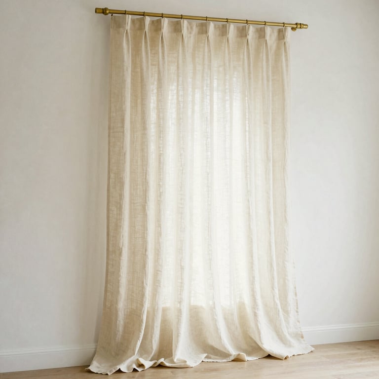
The most common mistake is choosing a wall color that is too cool, too stark, or too trendy. A crisp digital white reads as clinical. A cool gray reads as cold. A trendy color — however beautiful in the moment — becomes the thing you are decorating around rather than from.
The right wall color for a canvas is a warm neutral with a considered undertone. Not beige for the sake of beige — but a color with depth, warmth, and the ability to shift with the light throughout the day.
What to look for: Warm greiges (gray-beige hybrids with a green or pink undertone) are the most universally flattering neutrals in home design. They read as sophisticated without being cold, and they make every other color in the room look more intentional.
Verified benchmarks worth knowing:
Benjamin Moore Revere Pewter HC-172 — warm greige that shifts beautifully with light
Benjamin Moore Pale Oak OC-20 — lighter, airier, LRV of 68.64 (reflects significant light)
Benjamin Moore Edgecomb Gray HC-173 — the softer, more refined version of Revere Pewter
The rule on undertones: Every neutral has one. Warm undertones (red, yellow, orange base) make rooms feel intimate and cozy. Cool undertones (blue, green, purple base) make rooms feel airy and larger. The critical mistake is mixing warm and cool undertones in the same room — the result is a visual dissonance you feel but cannot name. Commit to one family. Always.
Always test in the actual room. Paint looks completely different on a chip than on a wall, and completely different in morning light versus evening light. Test a large swatch — at least 12 inches square — and live with it for 48 hours before committing.
2. Your Flooring
Flooring is the most expensive element in a room to replace and the one that most affects everything placed on top of it. It is also the element most people inherit rather than choose — which makes understanding how to work with it essential.
The foundational principle: Your flooring should be neutral enough to recede. It is not meant to be the focal point of the room. It is meant to be the ground — stable, warm, and consistent — that everything else stands on.
What works:
Warm-toned hardwood (honey oak, warm walnut, natural ash) — the most versatile and timeless flooring choice
Light stone or large-format tile in warm neutrals — travertine, limestone, warm porcelain
Natural fiber flooring (sisal, jute, seagrass) — adds organic texture while staying visually quiet
What to avoid: Cool gray-toned flooring, high-contrast dark floors in small rooms, and anything with a strong pattern or grain that competes with the rug above it.
If you cannot change your flooring: A large, well-chosen rug solves almost everything. Which brings us to the most important element of the canvas.
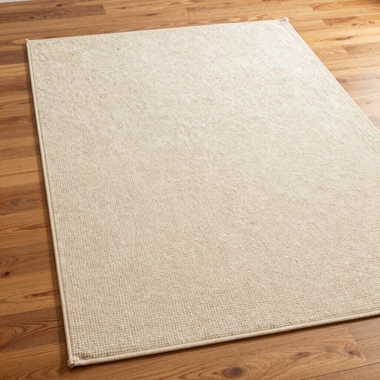
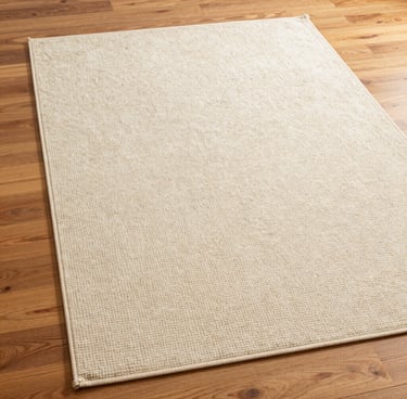
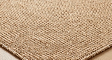
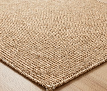
3. Your Primary Rug — The Most Underestimated Element in Home Design
If there is one element of the canvas that most people get wrong, it is the rug. Not because they choose the wrong style — but because they choose the wrong size, and because they treat it as a decorative accent rather than the structural anchor it actually is.
The rug is not decoration. It is architecture.
A properly sized rug defines the zone, anchors the furniture, and tells the room where it begins and ends. Without it, even the most beautiful furniture grouping floats — disconnected, unresolved, unfinished.
The sizing rule — the one that changes everything:
The front legs of every seating piece in your living room should sit on the rug. Not beside it. Not near it. On it. This creates a unified zone — a room within the room — that feels intentional and complete.
For most living rooms, this means:
8x10 feet as the absolute minimum
9x12 feet for larger seating arrangements
10x14 feet for open-plan spaces or large rooms
If you are currently looking at your room and realizing your rug is too small — you are not alone. It is the single most common design mistake in non-designer homes, and it is the single fastest fix.
What to look for in a canvas rug:
The rug that serves as your foundation should be:
Neutral in color — cream, oatmeal, warm sand, soft camel, natural ivory
Textural rather than patterned — the texture does the visual work without competing with anything above it
High quality in material — wool, wool-blend, or natural fiber. These age beautifully, hold their shape, and feel substantial underfoot in a way synthetic rugs never do
Low to medium pile — easier to maintain, more versatile, and more sophisticated in most spaces
A high-quality neutral wool rug in the right size is one of the highest-return investments you can make in a room. It will outlast trends, work with every furniture update you make, and make everything placed on top of it look more considered.
The undertone rule applies to rugs too. A cream rug with a pink undertone will clash with a warm beige wall. A rug with a cool gray undertone will fight a warm wood floor. Match the undertone family of your rug to the undertone family of your walls and floor. When all three align, the canvas becomes invisible — and that is exactly the point.
Why Neutral Does Not Mean Boring
This is the objection that stops most people from committing to a neutral canvas. They equate neutral with flat. Safe. Uninspired.
The confusion comes from conflating color with interest. A room's visual richness does not come from color — it comes from texture, contrast, scale, and light. A room with warm cream walls, a natural wool rug, and linen curtains is not boring. It is a stage. And a stage, by design, is meant to disappear.
The most visually rich rooms in the world — the ones that stop you mid-scroll, the ones that feel like they belong in a magazine — almost always have a quiet foundation. The drama comes from what is placed on top of it: the sculptural lamp, the aged ceramic, the piece of art that makes you feel something.
The canvas earns you permission to be bold everywhere else. Without it, bold just becomes noise.
The Longevity Principle — Why This Is Also the Sustainable Choice
Your floors, walls, and primary rug are the most expensive and most disruptive elements of a room to change. They are also the elements that most directly determine whether your room feels current in five years or dated.
A neutral canvas is inherently timeless. It does not belong to a trend cycle. It does not need to be replaced when the aesthetic pendulum swings. It simply continues to work — as a backdrop for whatever you layer on top of it, season after season, year after year.
This is intentional design. Not fast design. Not trend-chasing design. Design that is built to last — which is both the most beautiful and the most sustainable approach to a home.
When you invest in a high-quality neutral foundation, you stop the cycle of replacing things that no longer feel right. You build once, correctly, and everything else becomes a conversation rather than a correction.
The canvas is not the destination. It is what makes the destination possible.
Explore these products to start your foundation
The Aura Abode
Effortlessly curated design for the modern sanctuary.
© 2026 The Aura Abode. All rights reserved.
| HOME | THE COLLECTIONS | THE EDIT |
*The Aura Abode is a participant in the Amazon Services LLC Associates Program, an affiliate advertising program designed to provide a means for sites to earn advertising fees by advertising and linking to Amazon.com